Contact: David Firnando Silalahi
Investigators: David Firnando Silalahi, Andrew Blakers
Background#
Solar photovoltaic energy is the leading source of new electricity generation capacity deployment globally. Floating solar in calm seas could be a key driver of new solar energy growth in certain locations. Advantages of floating solar PV over land-based PV include reduced land requirements, a higher energy yield because the water allows for cooler operating conditions and also because there are far fewer structures to case shading in the open ocean and less cloud cover, and possible colocation of other existing infrastructure.
For densely populated countries such as Indonesia this could be a low impact method to extend utility solar without impacting local biodiversity.
Suitable locations will have low waves, low wind speeds, and no historical storms, because this reduces the cost of engineering defences required to protect the panels.
We assume 14 kW/70 m2 or 2 MW/hectare, and only investigated maritime regions within 300km of the shore. The combined offshore floating solar PV annual generation potential in the area that do not experience waves larger than 4m nor winds stronger than 15 m/s is 225,000 TWh. This study includes all maritime areas within 60° N and 60° S.
If maximum wave heights of 6m can be tolerated, then the annual energy generation potential rises to about one million TWh.
Publications and Media#
Silalahi, D.F.; Blakers, A., 2023, ‘Global Atlas of Marine Floating Solar PV Potential’, Solar, 3, 416-433. https://doi.org/10.3390/solar3030023.
Andrew Blakers, David Firnando Silalahi, 4th August 2023, ‘Limitless’ energy: how floating solar panels near the equator could power future population hotspots, The Conversation, republished on Renew Economy.
Using the data#
The csv files located below can be opened in QGIS to create the images shown in the Figures.
In the figures, a heat map colour key is used. Red areas are best (calmer) followed by orange, yellow, and green, while blue areas are the stormiest. Pale blue corresponds to maritime areas far from land that were not considered in this analysis. Purple areas represent marine protected areas. The dark gray line shows the history of tropical storms.
Figures 5-12 below show regions of particular interest.
In each cell in the Table, the numbers are (top to bottom): (i) area (thousands of km2); (ii) potential solar power (TW); and (iii) potential annual solar generation (thousands of TWh per annum).
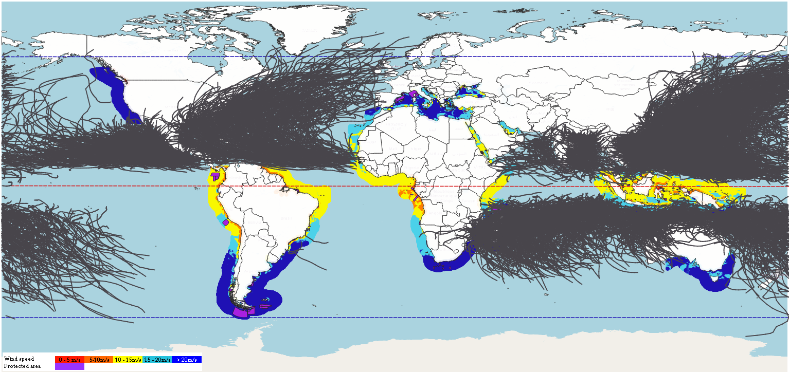 Figure 1. Wind QGIS output. Click here for a higher resolution image. Basemap: OpenStreetMap contributors.
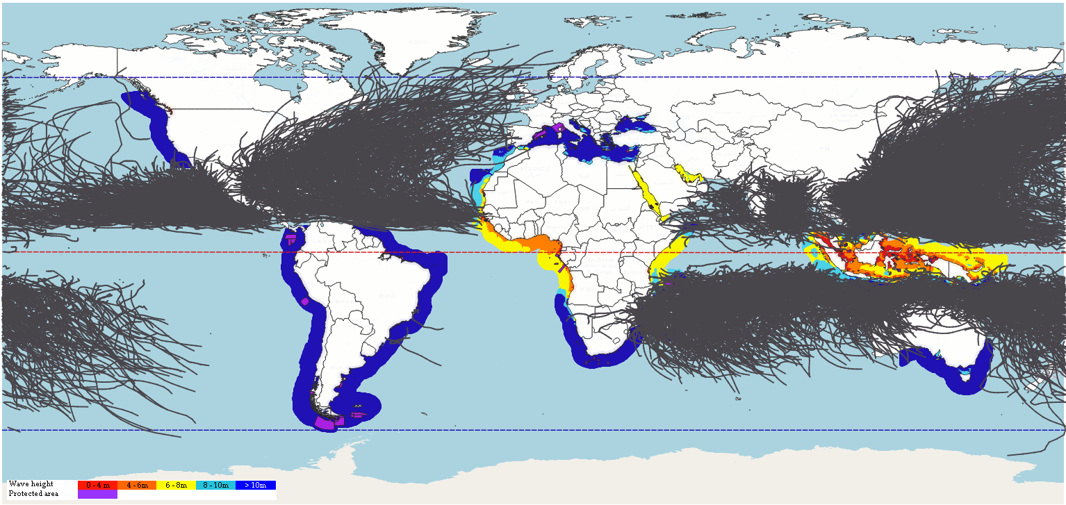 Figure 2. Wave QGIS output. Click here for a higher resolution image. Basemap: OpenStreetMap contributors.
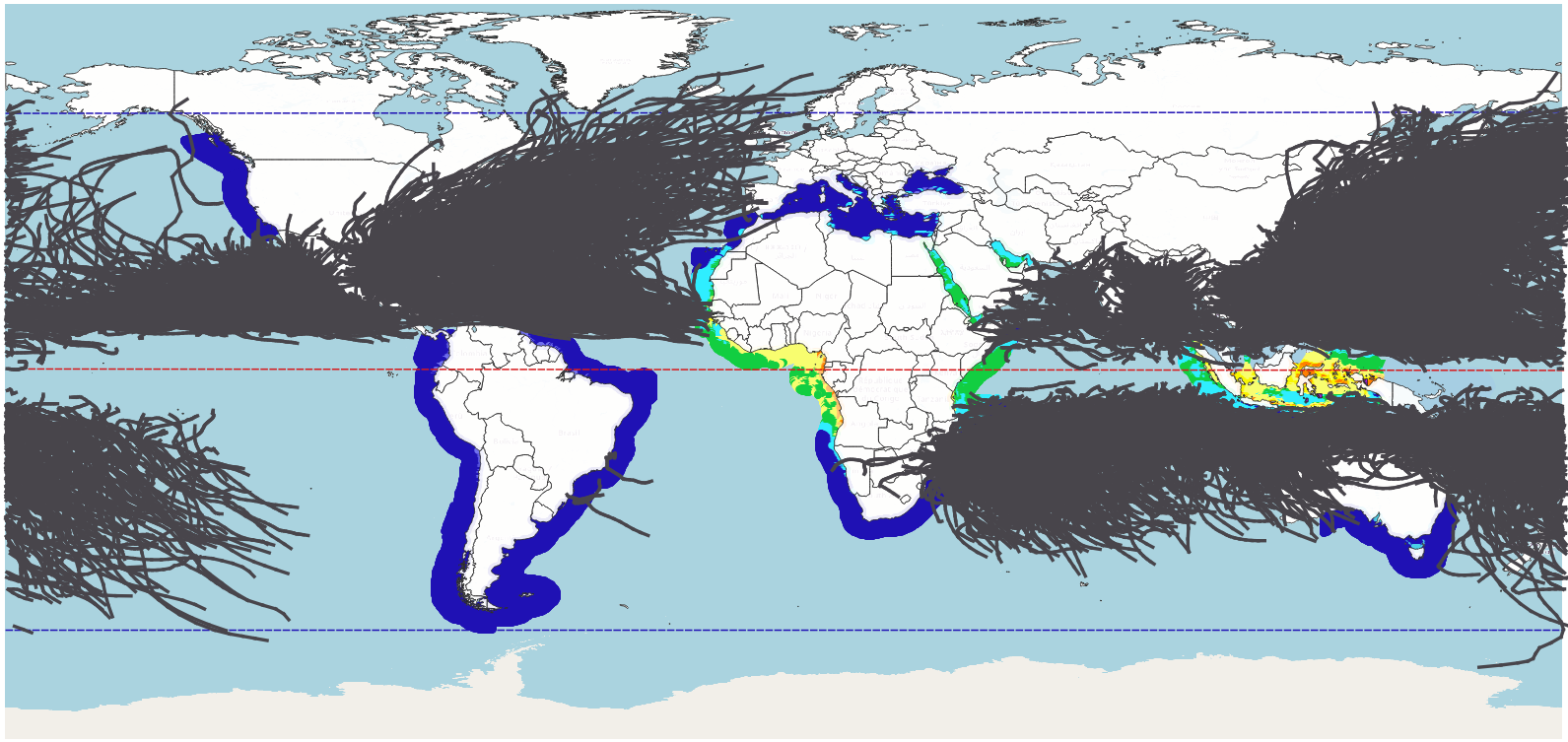 Figure 3. Combined wind and wave QGIS output. Click here for a higher resolution image. Basemap: OpenStreetMap contributors.
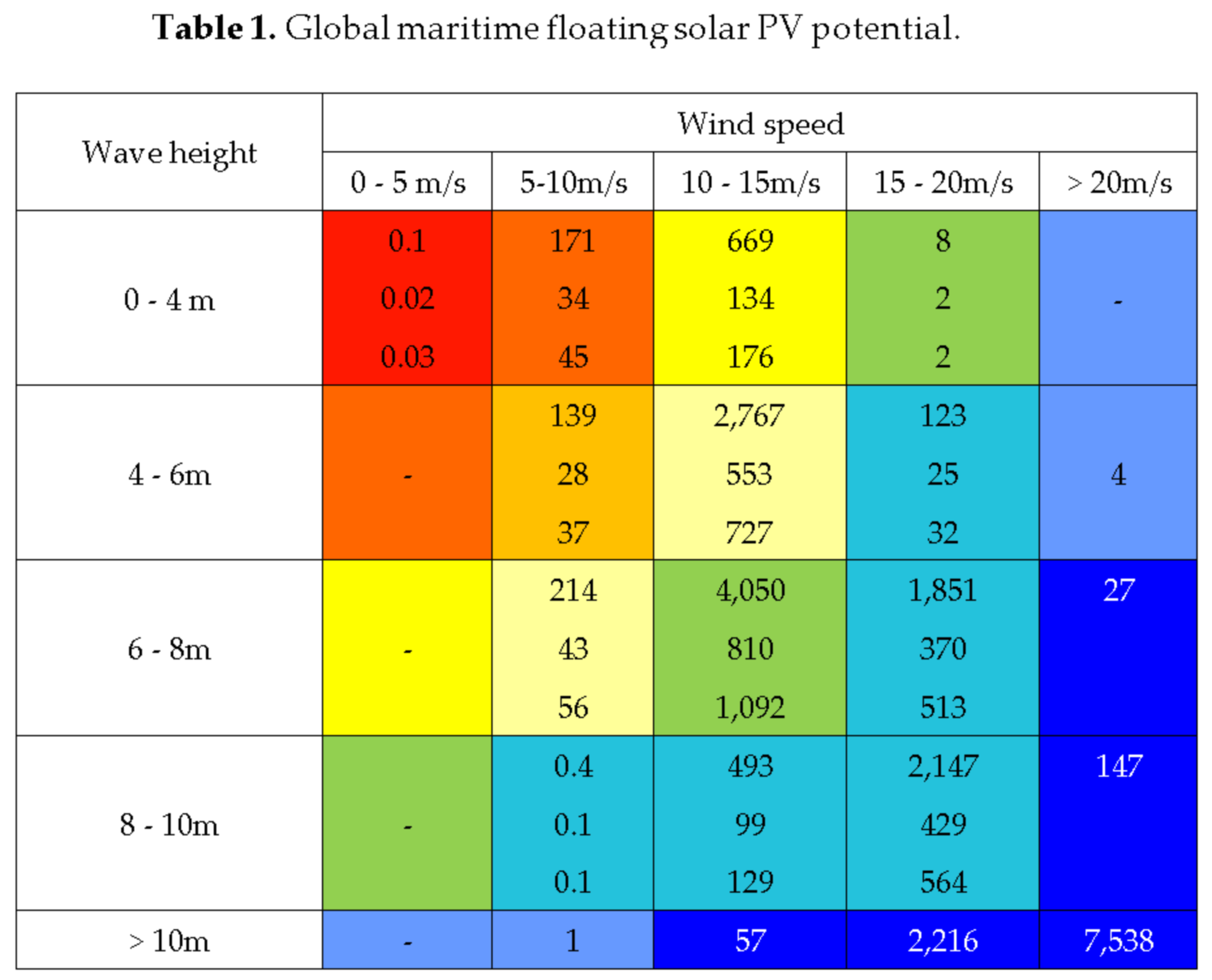
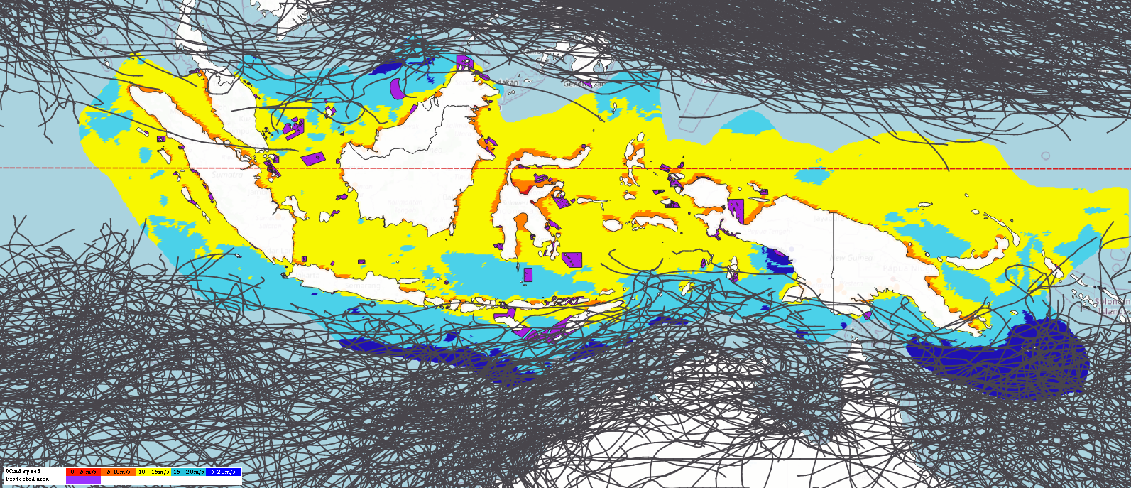 Figure 4. Southeast Asia wind QGIS output. Click here for a higher resolution image. Basemap: OpenStreetMap contributors.
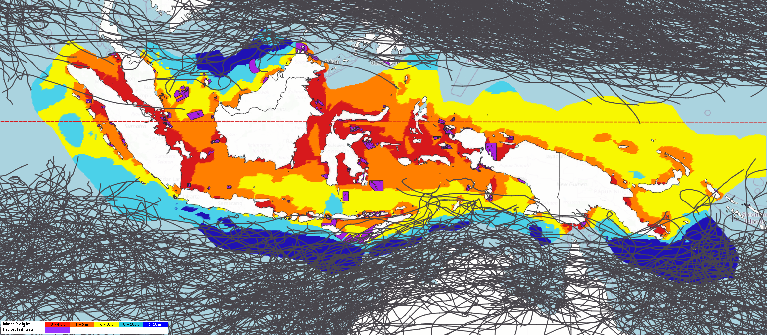 Figure 5. Southeast Asia wave QGIS output. Click here for a higher resolution image. Basemap: OpenStreetMap contributors.
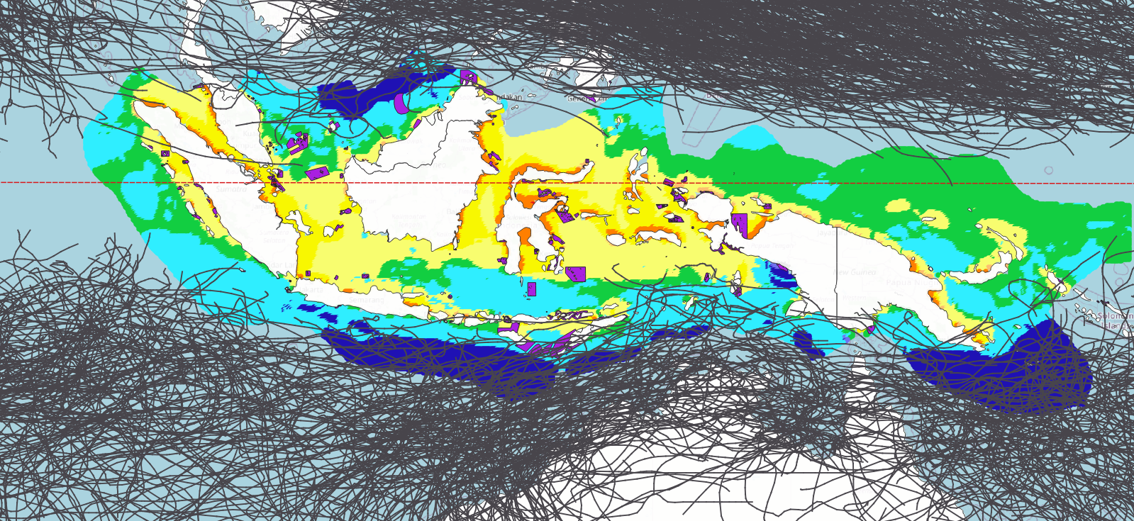 Figure 6. Southeast Asia wind and wave QGIS output. Click here for a higher resolution image. Basemap: OpenStreetMap contributors.
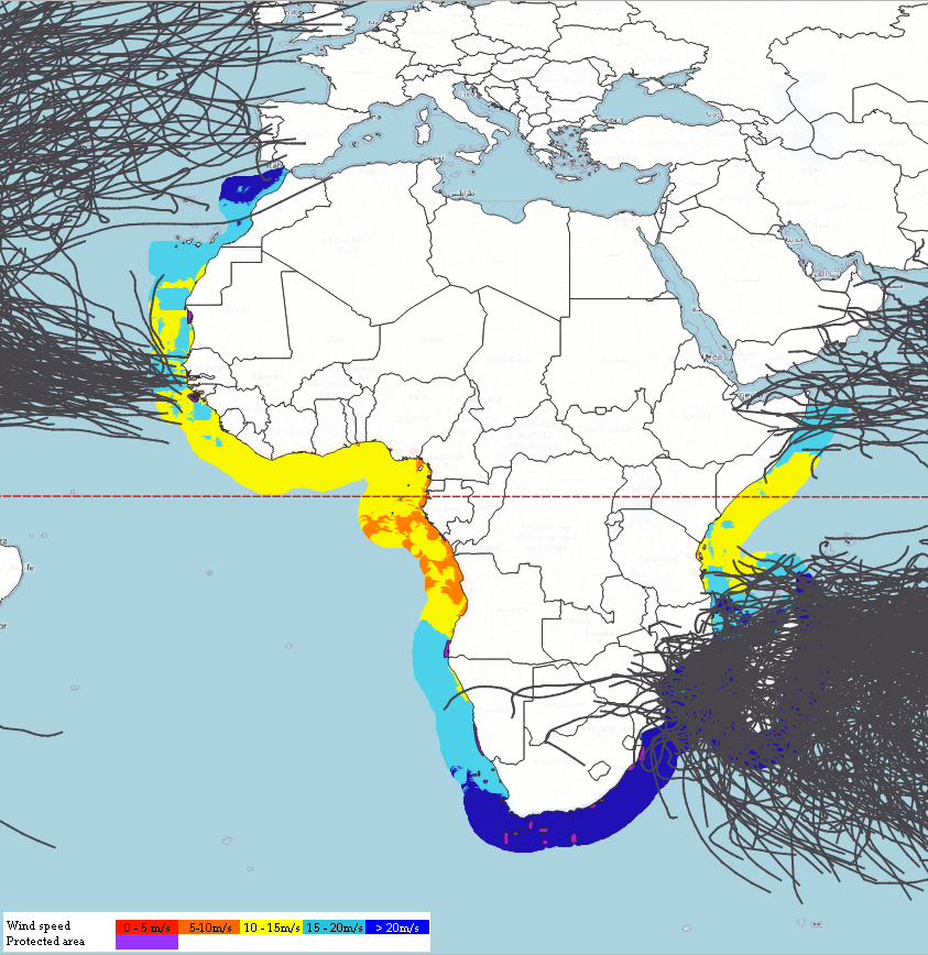 Figure 7. Africa wind QGIS output. Click here for a higher resolution image. Basemap: OpenStreetMap contributors.
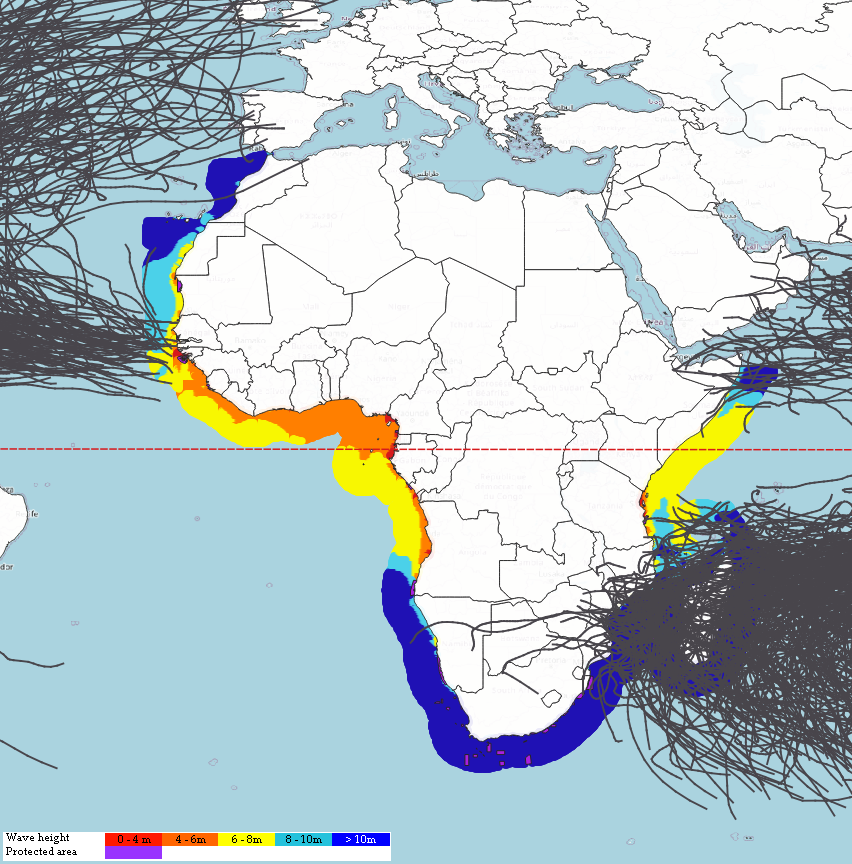 Figure 8. Africa wave QGIS output. Click here for a higher resolution image. Basemap: OpenStreetMap contributors.
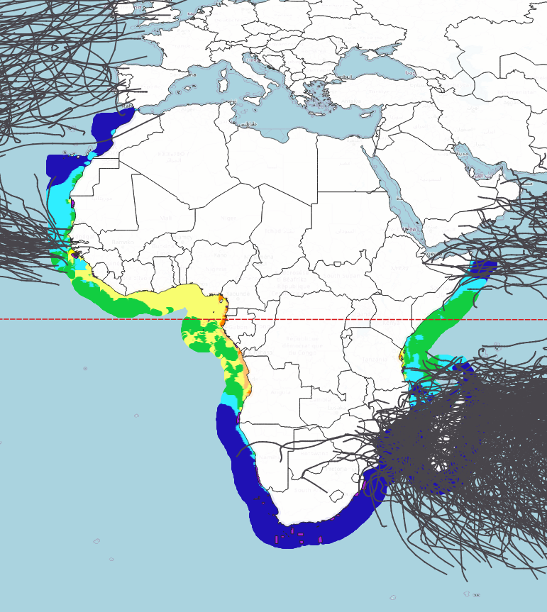 Figure 9. Africa wind and wave QGIS output. Click here for a higher resolution image. Basemap: OpenStreetMap contributors.
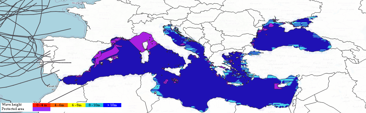 Figure 10. Mediterranean wind QGIS output. Click here for a higher resolution image. Basemap: OpenStreetMap contributors.
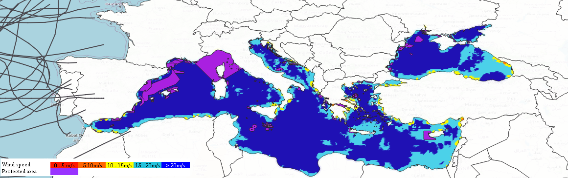 Figure 11. Mediterranean wave QGIS output. Click here for a higher resolution image. Basemap: OpenStreetMap contributors.
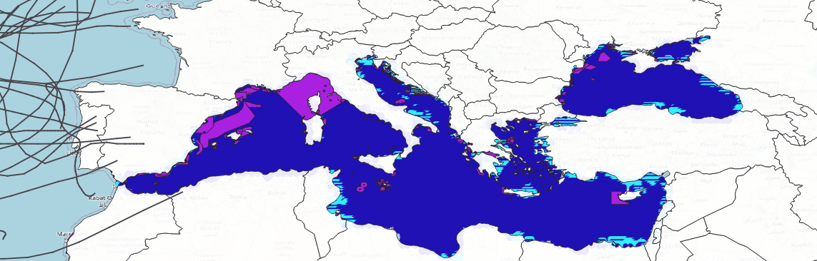 Figure 12. Mediterranean wind and wave QGIS output. Click here for a higher resolution image. Basemap: OpenStreetMap contributors.
Disclaimer
The wind and wave data made available here is provided “as is”. The best effort has been made to ensure the data are free from errors and provide a true and accurate reflection of real wind speeds. However, a full guarantee cannot be provided. Sites that appear to be commercially viable for floating solar farm development based on data from this site may be limited by geological, hydrological, environmental, heritage and other factors. As with all major engineering projects, diligent attention to quality assurance would be required for safety and efficacy. This is historical data, and thus the impact of climate change is not included.
Banner image from Ocean Sun